{inspiration} Timeless Shabby Chic


Those of you who are familiar with my work know that I frequently gravitate towards things that look lived in, pieces where the word "yummy" seem to be the perfect descriptive. I love pretty, feminine pieces in any space- especially paired with something masculine and modern. I love painted wood; whites, grays, blues and weathered black partnered with leather or chipping metallics. And who does "yummy", "slubby" and "mushy" better than Rachel Ashwell, founder of Shabby Chic Brands? Sometimes inspiration is just a whisper...a sort of quite magic. Happy week everyone.

*Photography via Cottage Style (Images of Rachel Ashwell's Los Angeles home)

HAPPY HALLOWEEN : Vegan nanaimo bars


A truly Canadian confection, the NANAIMO bar! These treats are a Canadian favourite! I know I use to love them before I went vegan. When I was surfing around the net looking for something yummy to make since it is Halloween. I found a recipe on the joyofbaking.com and thought it looked easy enough to veganize, and I was right!

Let me just say one little thing , I am not a fan of healthy desserts. If I need my sugar fix I pretty much go for it. Nothing will hold me back from the sweet sugary goodness of chocolate!  I can't imagine them lasting very long in the fridge. One year I made a batch of these with some truffles and gave them away as winter gifts, they keep nicely in the freezer.

We never get many kids for the trick-or-treats. We still carve the pumpkins and have a bowl of candy at the door (just in case).

my pumpkin

The best part about carving pumpkins is the seeds! I always pick through the guts to save them for roasting. This time I roasted 1 pan with garlic powder & sea salt, the other one had tamari sprinkled on it with black pepper. I roast the seeds on low heat 275 for about 1.5 hours. Turn the oven off, and let them sit for a while in there so that they are really dry. A tasty treat!

 2 whole pans of pumpkin seeds!!

our pumpkins

This is the recipe I got from joyofbaking.com and changed it to make it vegan

Bottom Layer:
1/2 cup earth balance 
1/4 cup vegan sugar
1/3 cup  unsweetened cocoa powder
1 egg replacement
1 teaspoon vanilla
2 cups vegan cookie crumbs (I used a digestive cookie and crumbed it in my processor)
1 cup  coconut
1/2 cup walnuts- coarsely 
chopped


Middle Layer:
1/4 cup earth balance
2 - 3 tbsp soy milk
2 tablespoons vanilla custard powder (Bird's) 
1/2 teaspoon pure vanilla extract
2 cups vegan powdered sugar

Top Layer:
4 ounces vegan dark chocolate
1 tablespoon earth balance


Bottom Layer: In a saucepan over low heat, melt the butter.  Stir in the sugar and cocoa powder and then gradually whisk in the egg replacement.  Cook, stirring constantly, until the mixture thickens (1 - 2 minutes).  Remove from heat and stir in the vanilla extract,  cookie crumbs, coconut, and chopped nuts.  Press the mixture evenly onto the bottom of the prepared pan.  Cover and refrigerate until firm (about an hour).
Middle Layer Using a mixer, beat the butter until smooth and creamy. Add the remaining ingredients and beat until the mixture is smooth.  If the mixture is too thick to spread, add a little more milk.  Spread the filling over the bottom layer, cover, and refrigerate until firm (about 30 minutes).
Top Layer:  In a heatproof bowl over a saucepan of simmering water, melt the chocolate and butter. Spread the melted chocolate evenly over the filling and refrigerate until the chocolate has set.
To Serve:  To prevent the chocolate from cracking, using a sharp knife bring the squares to room temperature before cutting. 

Yield: Makes about 25 squares


Have a Happy Halloween!


Soup on Sunday: Venetian Crab Soup

Booooo! My newly acquired Venetian mask.

I just returned from a fabulous 4 days in Venice with SFERRA (more to come in a few days). Last night we hosted a Halloween cocktail party and our quests wore masks that I brought home for the occasion. While in Venezia I had an amazing, very complex, sophisticated crab soup that I am trying to recreate. This recipe from Epicurious just might be the ticket.

The truth be told, I should be posting Halloween cocktails today. My husband came up with a few winners for the occasion, including: an Ichabod, a Pumpkin French Martini, a Ghoultini and a Black Widow. They were the hit of the party.

Venetian Crab Soup:

2 tablespoons canola oil
1 small onion, chopped
1 celery rib, chopped
1 small fennel bulb, trimmed and chopped
Shrimp shells from 2 pounds shrimp (reserve shrimp for another use)
1 (28-ounce) can whole tomatoes in juice
1 (1/2-inch) piece ginger, peeled and chopped
1 large pinch saffron threads, crumbled
1/4 teaspoon curry powder
1/2 California bay leaf or 1 Turkish
2 quart vegetable stock
1 (8-ounce) Yukon Gold potato
1 small celery root (celeriac)
1 tablespoon unsalted butter
1 pound jumbo lump crabmeat

Heat oil in a wide 6-quart heavy pot over medium heat until it shimmers. Cook onion, celery, and fennel, stirring occasionally, until golden, 8 to 10 minutes. Add shrimp shells and cook, stirring occasionally, until shells turn pink. Stir in tomatoes with their juice. Simmer, breaking up tomatoes slightly with a wooden spoon, 3 minutes, then add ginger, saffron, curry powder, and bay leaf and simmer 5 minutes. Add vegetable stock and boil uncovered 5 minutes.

Reduce heat and simmer uncovered 45 minutes. Discard bay leaf, then purée soup (including shrimp shells) in batches in a blender until finely ground, about 2 minutes per batch (use caution when blending hot liquids). Strain soup through a fine-mesh sieve into a clean pot, discarding solids.

Peel and dice potato. Peel and dice enough celery root to measure 1/2 cup. Add potato and celery root to soup and gently simmer uncovered until tender, about 15 minutes. Remove from heat and stir in butter and crabmeat. Season with salt and pepper.

Serves 8 as a first course.

Home improvement remodeling - Horizontals


Not so essential works were assumed. The private zone hasn't changed. A balcony in it have converted in a study. At guest, including kitchen, a corridor and a drawing room, there should be a possibility to unite and be divided. Therefore on a place of borders of these zones there were designs of sliding partitions.


The input on kitchen has been shifted. In a hall there was an additional space before a guest bathroom. Considering that the dwelling is equipped by system elements "the clever house", in the expanded hall the place for a control system was released by it.


The drawing room lay-out was defined by hobby of owners for music and cinema: here all has been executed so that quality of viewing of TV and music listening didn't suffer. A drawing room and corridor zone separate decorative pilons.


In apartment it is a lot of niches and shelves - for souvenirs, decors, techniques, accessories. A leitmotif uniting all apartment, - designs of a horizontal, a material and furniture. At transition from a premise in a premise horizontal giving changes. 


Round forms pilons and a tension ceiling in a drawing room became natural contrast under the form for horizontals. 


It would be desirable to give special attention to light: it too "clever", the programmed scenarios of inclusion and reenergizing of different groups of fixtures replace each other in the direction of the person, and brightness of illumination changes depending on time of days.

Home improvement replanning - Ost-West


Initial "material" over which it was necessary to work - two-room apartment in the old house. 

Home improvement replanning - Ost-West

Home improvement replanning. The decision meant association of two zones - kitchens and a hall - in one space. It is offered to arrange a sleeping room it is isolated in a distant part of apartment, near to a bathroom.

The drawing room a zone - the central part of apartment, it is combined with kitchen and a lunch zone, and isolated from a hall and a corridor. Here the cozy soft corner with a coffee table is established, all has to rest, and pleasant viewing of TV and video. The kitchen zone is raised on a podium that has allowed visually and to separate functionally it from a guest zone.

Such use of space has divided two opposite zones, without overloading a premise unnecessary architectural elements.
the apartment interior

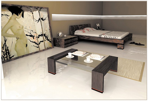
As a whole, the apartment interior is sustained in the strict style combining traditions and modern technologies. So adaptability to manufacture of the West in finishing materials is skillfully combined with forms of furniture and decorative panels of the East.


Free ideas of the West and wise philosophy of the East don't contradict, and mutually supplement and harmonize space. Thanks to the non-standard approach of the designer the apartment has got the maximum functionality, comfort and a modern kind.

Liquid Gold


It's my birthday on Saturday and J planned a special afternoon for us to spend together, I had no idea what we were going to do...but I had a idea it was going to have something to do with food! We stopped on route to grab a bottle of wine. (that's how I knew it was to do with food)

When we arrived at Liquid Gold, I was surprise to say the least. A Olive oil tasting bar? Huh? I have never heard of an olive oil tasting bar....but what was to come was one of the best experiences since living in Nova Scotia (besides the beaches!)

When we walked into the charming hydrostone building, it was lined with stainless steel barrels that were all shined up with spouts. I was excited!! Are you telling me we can taste ALL of these!

Yes that says CHOCOLATE Balsamic!


Not only do they carry the freshest olive oil you can get your hands on here, but they also have a tons of different balsamic vinegars. I was in heaven! The owners Bill & Myrna were super nice and let the little one explore there store while we tasted. I got a bit of a background about the olive oil, which was really cool.

 Leeluu chill'n with the owner Bill
Once I finished tasting it was the deciding that was hard. I choose the 18 year old balsamic vinegar and two olive oils. One was a very mellow tasting oil with a hint of apple ( Manzanillo), and I also choose a flavored olive oil the mushroom & sage.  The bottles are neat and if you bring them back for a refill you get a little discount! I had a great experience at Liquid Gold, I won't buy olive oil anywhere else after tasting fresh stuff!


I will be blogging a lot more with vegan MOFO just a few days away! I hope to get some good pictures, with winter on its way I find it harder to get pictures of what I am cooking, the light just isn't the same.

Classic


Wish of the customer - at purchase of apartment the choice has fallen on construction of Stalin times not casually. The height of ceilings, therefore and desire of the customer to keep and "increase" visually by means of design cunnings premise height quite clearly was the basic criterion of a choice.

Home improvement remodeling - Classic

Home improvement remodeling - dismantle of partitions between a drawing room and kitchen, a toilet, a bathroom and a pantry, a bedroom and an office became the first stage. Bearing designs of walls were dictated by the conditions, therefore the turned out asymmetry has predetermined a variant of zoning of premises of kitchen and a drawing room. 

Rack of a bar attached to the bearing design skillfully beaten by the designer, became not only an interior and furniture subject, but also a dividing element. Between an office and a bedroom partitions are taken partially down and moved towards a bedroom that has allowed to build in a huge bookcase the formed niches. 

Pass from a corridor on kitchen which was used by former inhabitants of apartment, has lost the urgency, and has been solved, having put pass by a brick, to use turned out alcove as a bathroom. 

The form of premise of a bedroom remodeling ideas too has undergone certain changes, in which course it was possible to receive an equal wall at a bed headboard, it has allowed to clear up imaginations of the designer. So there were cut columns with the latent illumination, which steels successful alternative to notorious bedside tables.

The children's room of global changes hasn't undergone, in it the dream of the nine-year traveler is realized. Thus, the former communal flat has turned to refined dwelling in old kind traditions of classics.

{product+love} PATTERN wallpaper & fabric


Oh, how I love pattern and print. For me a great pattern narrates a room, establishing your complete color story with its presence. So something special happened at Elle Decoration this Fall; they turned out a gorgeous pattern book showcasing their top selections of autumn/winter wallpapers and fabrics for all of us to behold. Their picks are a wonderful compilation of florals and fauna, illustrative effects and classic prints. Together the collection is elegant and calm yet quietly forward moving. I hope you enjoy a few of my favorite picks. Have a wonderful weekend all...

Image 1. Tropical Birds' wallpaper, Cole & Son | 'Yarrow' silk fabric in Tumeric/Grape, Clarissa Hulse
Image 2. 'Decatur' linen-mix fabric in Rame Grigio by Armani Casa, Rubelli | 'Ostrich' wallpaper in Goldleaf on Brownstone, Beware the Moon | 'Staunton Mohair Gauf' fabric in Truffle, Ralph Lauren Home | 'Truffle' viscose-mix fabric in Miel, De Le Cuona
Image 3. 'Dandelion Mobile' silk fabric in Sunflower Yellow, Miss Print | 'Chevron' cotton-viscose fabric in Sulphur, John Lewis | 'Styvmorsviol' linen-cotton fabricc by Linda Svensson for Mairo, Northlight
Image 4. 'Memento' wallpaper by Amy Butler, Graham & Brown | 'Define' rayon-mix fabric in Marine by Barclay Butera, Kravet London | 'Dimapur' viscose-mix fabric in Blu by Armani Casa, Rubelli
Image 5. 'Rues des St Peres' viscose-cotton fabric from the 'Sonia Rykiel Maison' collection, Lelievre

*Photography via Elle Decoration: October 2010

Russia


Wish of the customer - owners of apartment represent the habitation not only as inhabitant of two persons, but also as a place where harmoniously cooperate the modern approach in design and Russian national traditions. 


And not simply cooperate, and interpret and develop each other, creating individual and cozy inhabitant.

Home improvement remodeling - Russia
Home improvement remodeling. In a basis of functional zoning and a lay-out the idea of social human nature which cooperates with personal uniqueness is put. The apartment is accurately divided on two zones – public and intimate. In one the social human nature whereas in the personal the requirement of the person to a solitude is more full opened is realized. The erotic idea bedrooms is united from a bathroom. These zones are divided by a glass partition which is if necessary closed by a light-proof screen.

home interior remodeling - russia
 

The stylistic decision of home interior remodeling. The modern style which is meeting the requirements of a rhythm of city life, is harmoniously combined with ethnic, national motives. Geometrical ornaments and forms of national creativity are used as decorative and functional elements of an interior. White and red surfaces of walls, a floor and a ceiling are surprisingly combined in glossy and matte variants, in volume impressive drawings of decorative frescos with a skin, textiles, metal and furniture plastic.

apartment center
Accent. In the apartment center there is a wall with the big round cut, symbolizing the Russian furnace which always was the central element of habitation. In round cut it is possible to settle down conveniently (as on the furnace). In a bedroom interior create mood romantic plots from national creativity.


Home improvement remodeling - Without doubts


Apartment in the house constructed in 2005, zoning free. The layout of this apartment has already been successfully changed by customers. The author of the project should work only a little to create integral convenient space. 

Home improvement remodeling - Without doubts

Home improvement remodeling: the main accents of the project were reduced to equal lines, lightness of space, light tones and a minimum of contrast decisions, say, to that won't bother even after the lapse of any time.

The entrance zone has successfully contained in itself a pantry and a clothes for visitors. In a hall there was a podium for the organization of a sofa and a wall for the TV. 
Bathroom remodeling ideas

Bathroom remodeling ideas: bathroom and clothes zones have changed in places. And premises of the inconvenient form which couldn't be transformed, have allocated in a special way. So there was a wall with a white facing brick which is highlighted by the fixtures which have been built in a pebble on a floor. In the same place the path underlining length of a room and the leader directly to a bathroom has been laid.

Bedroom remodeling: in a bedroom the bed with a decorative back wall has taken place. This premise is divided by means of illumination. The room for the child has turned out bright, but too is sustained in style of all  interior apartment decisions.

And here the guest bathroom has been solved unusually - in orange tones: here customers wanted something unusual and shocking. The form of an interior of all apartment and primary color of walls are supplemented with an easy veil, contrast furniture and black-and-white pictures.

{idea notebook} Decorating For Fall


As the wind turns brisk and a constant chill sets into the air it is comforting to cozy up inside. Blankets and scarves as tablecloths, dried harvest fruit tucked into beautiful wreaths, candles, pine cones and evergreens gracefully adorning your hearth... fall is here, it's here, it's here...

*Photography via Better Homes & Gardens
Related Posts Plugin for WordPress, Blogger...
My Ping in TotalPing.com